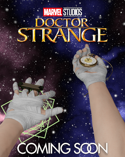
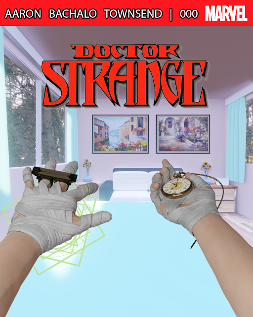
The poster was co-created by CGFlow, and a breakdown of everything is right below here. Please consider supporting these awesome artists. This would not be possible without any of them.
The background is by El Brujo de la Tribu.
The sling ring is by RadLadFrench and 3DTechDesign. I used some elements of each for one ring.
The hands and wraps were custom-made by CGFlow.
Titles are from Fanart.tv, just like my Vudu video.
Sad to say I really was just the idea guy on this one, and these creators, especially CGFlow, deserve the the credit for the poster. I just put all the pieces together once they were made or found. Again, please check out everyone's work and consider asking them for a commission.
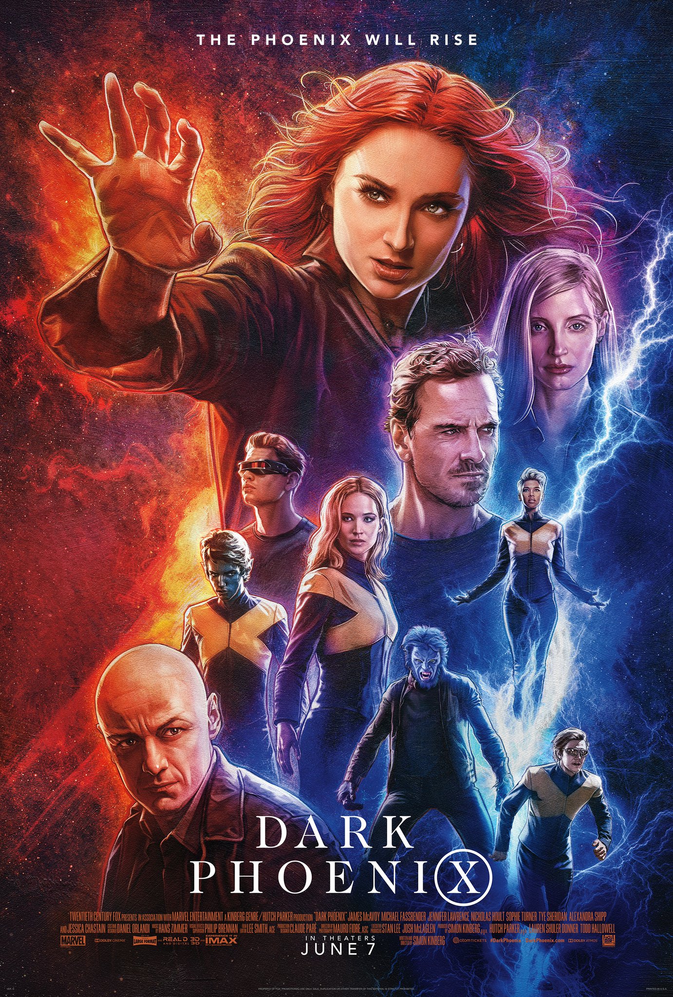
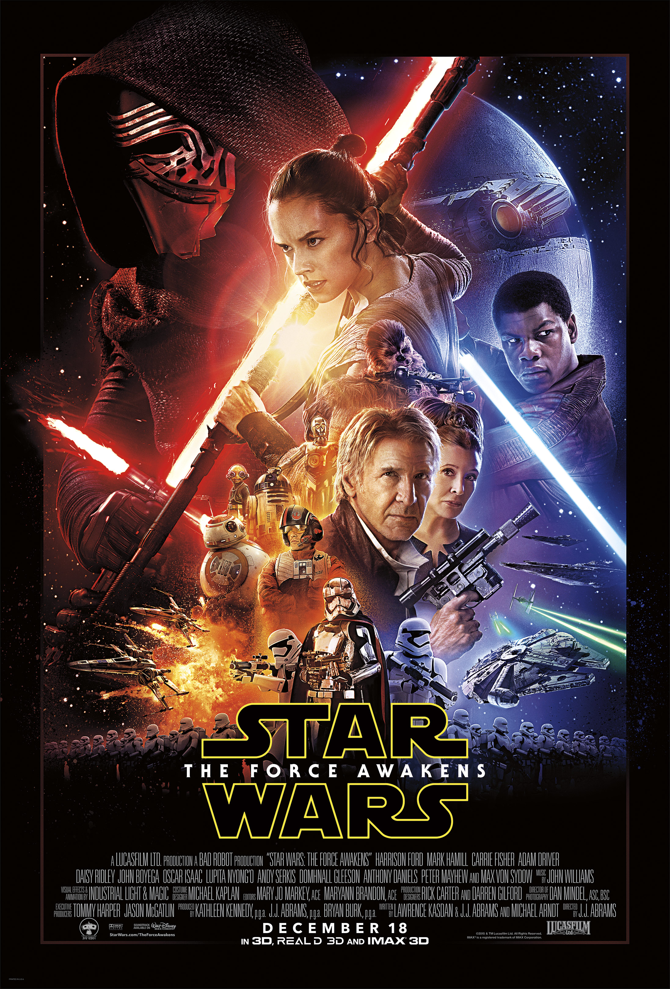
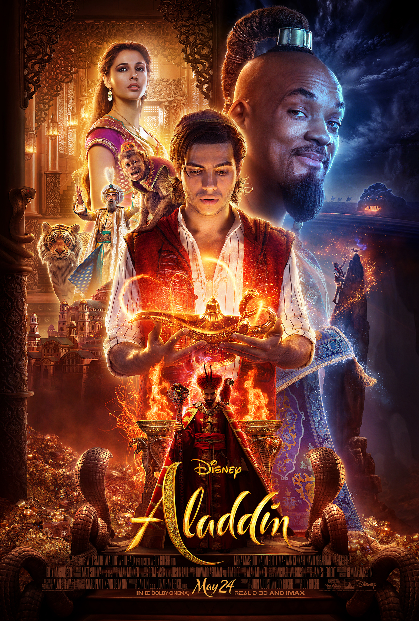
People have really taken notice of movie posters lately, but it's been in an unexpected way. Lazy poster design is being called out across the industry, especially when it comes to franchise films. We're seeing the same color scheme, and we're seeing stars' faces arbitrarily filling the page. It gets the job done at a basic level, and maybe celebrities are causing the second problem and making it part of their contract for exposure, but ad campaigns at this scale need to vary. The movies have roughly two hours to cater to everyone. The posters have a few seconds.
Teaser and concept posters can bring in the tiny piece of the movie-going population who doesn't know what a great guy Paul Rudd is, and luckily Marvel sometimes recognizes that.
Someone made a meme putting these three together, with the caption "I've Watched This [Disney] Trilogy 5 Times And I Still Have No Clue What's Going On."
This may be shifting to a new design all studios are adopting. So, that's a small win and loss.
It's also a great way to test if a movie, or some part of it like a character's look, will work or not. It can be done before production is far along and a lot of money is spent. And, most importantly, with open-source software like, as mentioned, Gimp ("free Photoshop") and Blender 3D, fans can put their own spin on these kinds of posters too. I was surprised some version of this Doctor Strange poster wasn't done already, so you'd be surprised what's not out there yet and waiting to be created.







0 comments:
Post a Comment