The movie is written and directed by Mike Rianda and Jeff Rowe (both writers on Gravity Falls and Disenchantment), produced by Phil Lord, Christopher Miller, and Kurt Albrecht, and it was set to be a Sony Animation/Columbia Pictures release before Covid-19 made them sell the distribution rights to Netflix. So, Sony Animation, Lord, and Miller, that's why this movie is as off-the-wall and colorful as it is. However, this is quite different in its look and feel.
It's incredibly fast-paced, and it very rarely sits and breathes. For a movie with a smartphone focus, it makes a lot of sense to occasionally cut to a semi-random YouTube video as quickly as we go to them just because something popped into our heads. It's not a kid to adult thing, it's a generational and tech shift that we're all adjusting to. And we always will, as each shift and advancement is leaps and bounds greater than the one before, and it always comes with new communication skills to adapt to. I'm in my (late) 20s and don't fully understand how my younger cousins use some of the apps that they enjoy, but the point is being open to those new things and learning from my family. That's what this movie is about. So with the big lesson out of the way, let's talk about why it works so wonderfully, the characters and the humor.
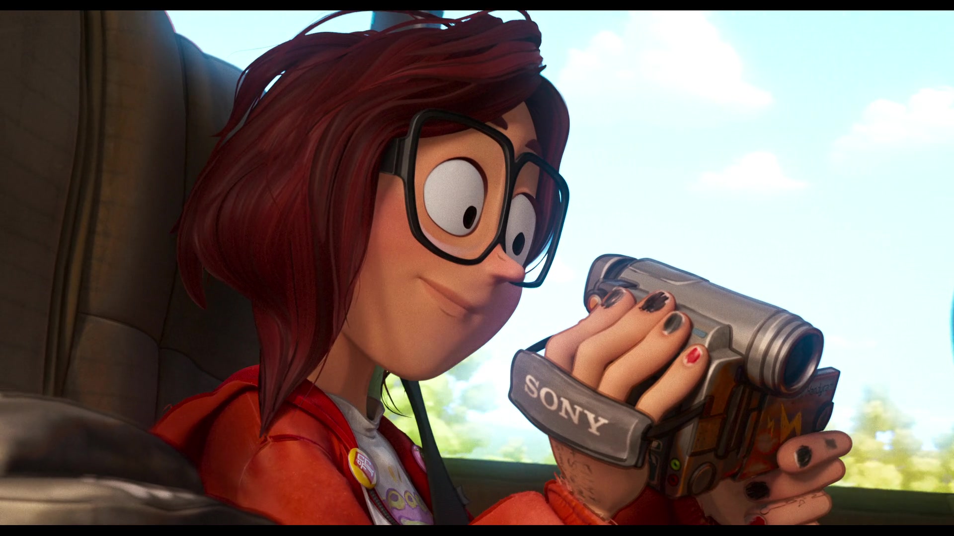
Katie is the best kind of film student and (future) auteur. She loves learning about the process and technical aspects, she uses her shorts to speak from the heart, and has no fear. And Rick is kinda the best kind of concerned parent, when it comes to this. He doesn't fully understand her videos, the industry or those technical aspects, but he does understand it's competitive as hell and a tough way to make a living, especially in a major city. As someone who crashed and burned a year into studying animation, switched to business, and just does film stuff for fun, Rick is right to be concerned. The difference between my situation and Katie's isn't that Katie can draw and will be a few steps ahead of her classmates, but it's that my parents were aware that failing in early adulthood is okay and there's plenty of room to pivot. He thinks a setback could be catastrophic, and her experiencing that scares him because he's a pretty awesome dad. That's not something I thought I'd say about a character voiced by Danny McBride. Before getting to him, it's worth noting this movie has an even-handed say on film school. Very simply, take it or leave it, depending on the person and what they want to specialize in. Film school is if you want to be on-set and learn how to collaborate, and self-teaching is for people like me who don't get involved in production.
From early previews, it looked like Rick would go full-Ron Swanson and be voiced by Nick Offerman. And they can do that without those characters being overly similar, but it'd still probably be distracting. Instead McBride is pretty unrecognizable. It's not just that Rick is sweet, but it's a complete change, as his accent largely drops, he's more timid in intimidating situations, and any trace of something like bravado is reserved for mountain-man and dad joke moments. Those moments are great. I hope he, or some piece of the cast, at least gets an Annie nomination for creating this incredibly lived-in family dynamic. Hopefully it's revealed that a lot of the recordings were done at the same time.
The humor kind of reminds me of watching Storks, and that reminded me of 2010s Cartoon Network. What I said then is "No one gets society like Warner Brothers Animation," as they handle everything from technology, to representation, to millennial culture, and more. Sony Animation can be added to that list; they put a huge emphasis on making jokes character-driven. One of my favorite little ones is the justification of the slow-motion walk after an explosion. Being like Katie, and having a camera, is all the justification you need...and how many opportunities are there to do that with other people. It's much more badass with a group. The explosion, surprisingly is one of the visually restrained moments of the movie, unlike when Sony and Warner Brothers had two stunning ones in Storks. Efforts were put into a million little moments instead of a few big ones, and the payoff is much larger...possibly too large.
Painstaking efforts were put into making Spider-Man: Into The Spider-Verse look and move like a comic book. So this has to be made clear, those same painstaking efforts were put into making Mitchells look like a cross between a phone screen, that's opened to Instagram or Snapchat, and a lightly done anime. Filters and social media stickers are used a lot in this movie. It's not like it's just for fourth-wall breaking moments, but it's stitched right into the movie. Since so much of that is 2D, it really pops, sometimes more than the computer-animated components. That's what Spider-Verse had going for it but a bit more scaled back.
This is on top of the break-neck speed Sony Animation has become known for, so the results can be quite taxing to the eyes, especially during the action-packed climax. At nearly two hours, cutting ten or twenty minutes would've helped with late-stage burnout, but in a movie like this there's no telling what could've been incidentally lost.
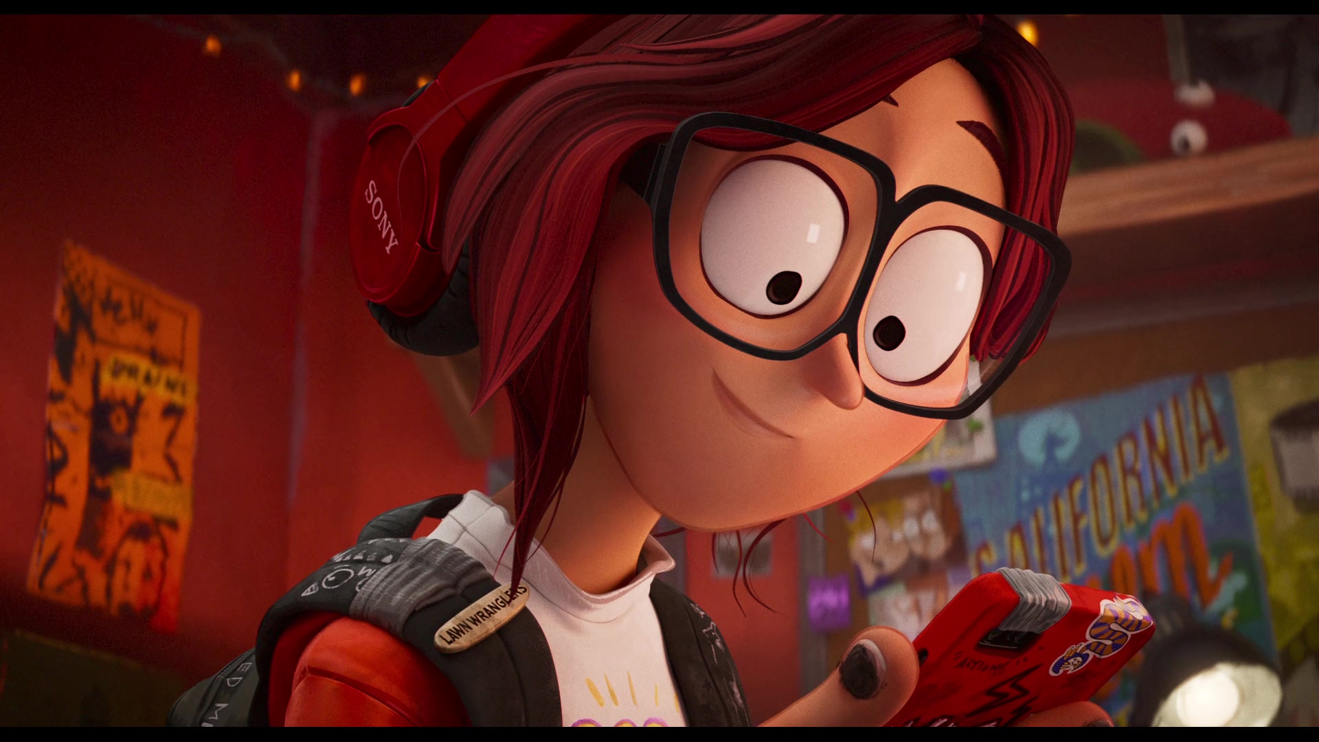
Re-watching the movie for this review, and pausing let the details really sink in, like a lot of the movies that inspire Katie being part of the K Collection. I'd like to think that it's personally made for her, or it's this universe's version of the Criterion Collection, similar to how they also have a store named Good Get. Sony itself seems to lack a knockoff when it comes to their headphones and cameras, of course.


Creativity and a great story in exchange for some bill-paying product placement can be a pretty fair trade | Copyright 2021 Sony & Netflix
This is an odd way to recommend the movie, but I think one of the best ways to test it out is to watch the first ten minutes or so, and if the visuals are straining, consider turning your screen off and just listening to it with the movie's audio-description settings for the blind. If the viewing experience is too nontraditional, try reading the script because the story is very well-written. While better together, every element of the movie stands on its own.
One last thing, seriously, say please and thank you to your Alexas/Siris/Cortanas. It sounds ridiculous, but it reinforces our P&Qs, and it's a good way to teach manners and basic behaviors to children. The fact that that never happens in this movie, even after meeting good machines, is a major knock against the movie and a weird oversight. It's a disconnect in the movie formerly titled Connected.
Note: I highly recommend listening to Mike Rianda's interview with the Next Best Picture's Matt Neglia. What struck me is when Rianda talked about how the visual style directly relates to Katie's filmmaking style. Without spoiling the interview, stuff like that adds a lot both to the movie itself, its development, and what we can expect from Rianda and, possibly, Rowe next. NBP's review of the movie can be found here. I really look up to these guys, and they put Promising Young Woman on my radar like a year before it even came out, so this is the least I can do as a fan who wanted to return that favor. CinemaWins did a fantastic video on the movie, too.
Finally, if you are like Katie, please look into film school and the free filmmaking resources available to you. Even if you want to teach yourself, a school's curriculum can provide a helpful learning path. Katie taught herself Photoshop, and you can learn free programs like Gimp (free Photoshop), Openshot (video editing) and Blender (animation and video editing). Finding the right beginner tutorial or starting point is tough because everyone learns differently, but once you find it, you'll pick these tools up in no time.


0 comments:
Post a Comment